ADLINK
EDGE COMPUTING / IDENTITY SYSTEMS AND DESIGN VISION
We gave ADLINK a visual grammar that could carry technical products, data, events, and physical spaces without making them look like one format.
We gave ADLINK a visual grammar that could carry technical products, data, events, and physical spaces without making them look like one format.
ADLINK operates in edge computing through technical products, digital communication, and physical environments. Its public expression had to carry detailed information and a wide product range without losing the character of the business. The task was to give teams one visual basis for unlike material without reducing the company to a familiar technology look.
ADLINK operates in edge computing through technical products, digital communication, and physical environments. Its public expression had to carry detailed information and a wide product range without losing the character of the business. The task was to give teams one visual basis for unlike material without reducing the company to a familiar technology look.

Challenge
Challenge
ADLINK did not need a cosmetic update. It needed a way to move from product data to a presentation, an exhibition, or a piece of digital communication while remaining recognisable. One fixed composition would have failed when the format changed. A loose collection of assets would have left each team to invent its own answer.
ADLINK did not need a cosmetic update. It needed a way to move from product data to a presentation, an exhibition, or a piece of digital communication while remaining recognisable. One fixed composition would have failed when the format changed. A loose collection of assets would have left each team to invent its own answer.
What we did
What we did
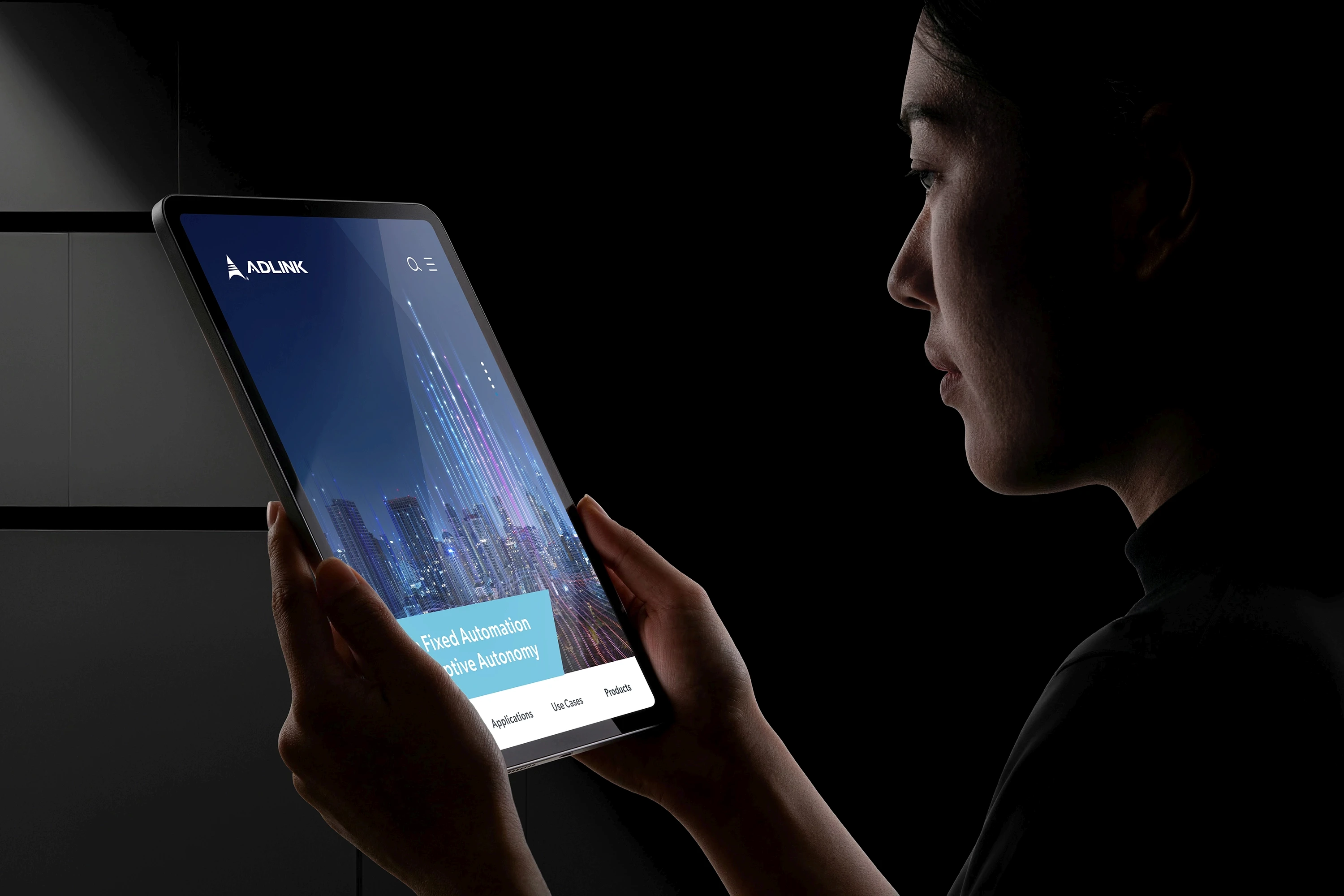
As Design Director, we created the identity refresh and the visual rules for its use. A modular grid, graphic devices, colourways, typography, and image treatment allowed the identity to change with the material. The 103-page Visual Standard Guide set out applications for collateral, presentations, digital communication, motion, and exhibitions, with the same visual basis carried into each format.
As Design Director, we created the identity refresh and the visual rules for its use. A modular grid, graphic devices, colourways, typography, and image treatment allowed the identity to change with the material. The 103-page Visual Standard Guide set out applications for collateral, presentations, digital communication, motion, and exhibitions, with the same visual basis carried into each format.
Why it mattered
Why it mattered
The grid was not a decorative device. It set the relationship between information, graphics, image, and space so the identity could change shape without losing its character. That mattered in an enterprise where a product manual, a launch presentation, and an exhibition wall carry different amounts of information but still speak for the same business.
The grid was not a decorative device. It set the relationship between information, graphics, image, and space so the identity could change shape without losing its character. That mattered in an enterprise where a product manual, a launch presentation, and an exhibition wall carry different amounts of information but still speak for the same business.
The engagement produced the 103-page Visual Standard Guide, source design files, and applications for brand material, presentations, digital communication, motion, and exhibition environments. The guide records how the visual rules change with format while keeping ADLINK recognisable. No adoption or commercial result is claimed.
Relevant expertise
Identity Systems
Design Vision
Modular Layout Systems
Visual Standards
Enterprise Touchpoints
.related work