Kyros
RECOVERY CARE / IDENTITY, MARKETING, AND PRODUCT DESIGN
We created Kyros's identity and early product direction so people seeking recovery support met a service that protected dignity without retreating into pity.
We created Kyros's identity and early product direction so people seeking recovery support met a service that protected dignity without retreating into pity.
Kyros was conceived as a digital service connecting people experiencing Substance Use Disorder with Peer Recovery Specialists, providers, recovery centres, insurers, and related support. It had to be present at a difficult moment for someone seeking help while remaining credible to the people and organisations responsible for care.
Kyros was conceived as a digital service connecting people experiencing Substance Use Disorder with Peer Recovery Specialists, providers, recovery centres, insurers, and related support. It had to be present at a difficult moment for someone seeking help while remaining credible to the people and organisations responsible for care.

Challenge
Challenge
Recovery support is often presented through clinical distance or charitable emotion. Kyros needed to acknowledge the seriousness of Substance Use Disorder without making people seeking help feel defined by sadness or pity. The identity also needed to work for the person asking for support, the peer specialist, and the organisations involved in care.
Recovery support is often presented through clinical distance or charitable emotion. Kyros needed to acknowledge the seriousness of Substance Use Disorder without making people seeking help feel defined by sadness or pity. The identity also needed to work for the person asking for support, the peer specialist, and the organisations involved in care.
What we did
What we did
We created the original identity, brandmark, website, and fundraising decks, then continued with marketing, internal training material, and selected product UI and UX. Typography, colour, pattern, iconography, photography direction, and practical standards gave each material a shared basis. The work covered the period before the product launch and the later retained design engagement.
We created the original identity, brandmark, website, and fundraising decks, then continued with marketing, internal training material, and selected product UI and UX. Typography, colour, pattern, iconography, photography direction, and practical standards gave each material a shared basis. The work covered the period before the product launch and the later retained design engagement.
Why it mattered
Why it mattered
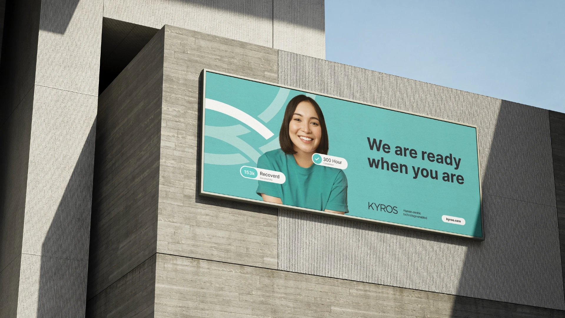
The mark placed an intersecting wave K inside a defined frame. It made the identity feel present and capable without using the sadness, pity, or institutional distance common in recovery communication. Compassion in recovery care must preserve dignity and choice. That principle shaped the visual language and the materials people encountered before they asked for help.
The mark placed an intersecting wave K inside a defined frame. It made the identity feel present and capable without using the sadness, pity, or institutional distance common in recovery communication. Compassion in recovery care must preserve dignity and choice. That principle shaped the visual language and the materials people encountered before they asked for help.
Before the product launch, Kyros had a public website, a fundraising narrative, and internal training material for Peer Recovery Specialists. During the retained engagement, the identity was applied to marketing, selected product work, and physical material. The case makes no claim about care, user, commercial, or later organisational results.
Relevant expertise
Brand Building
Identity Systems
Product Design Direction
Marketing Design Direction
Rollout Standards
.related work